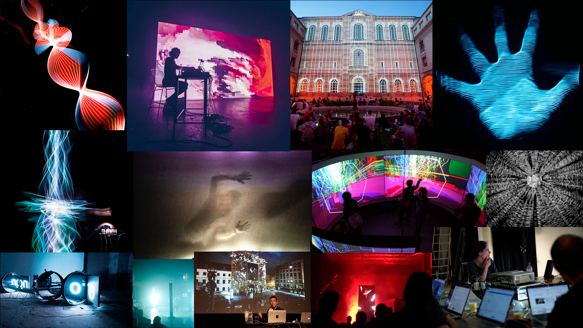
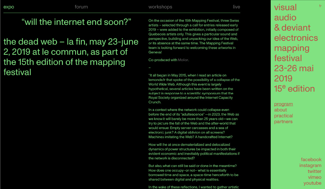
The Mapping Festival is about using digital methods across multiple disciplines to create and share work. For this project I wanted to showcase this very idea of the creation of visual media from lines of machine language.
To represent this process, I would only use typography to generate all images and animations seen on screen. At the same time, this project would remain consistent with the festival's existing branding.
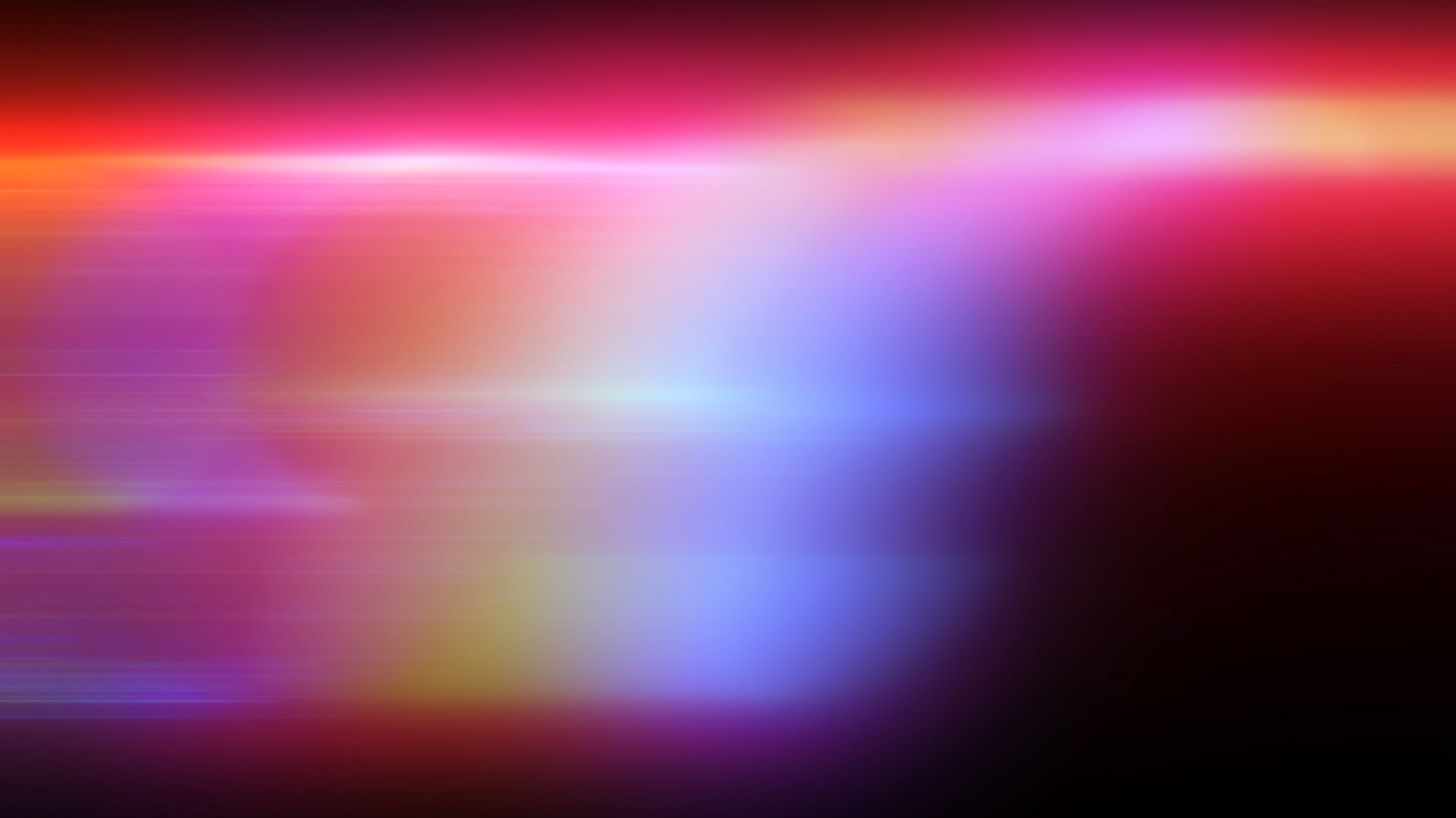
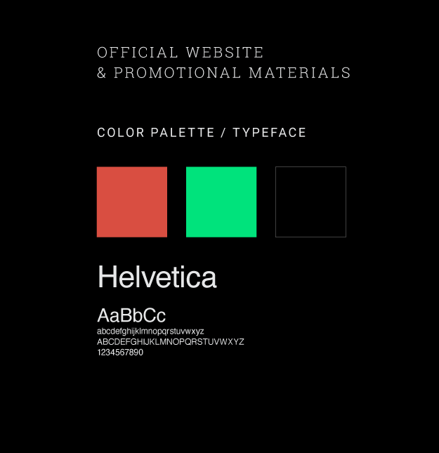
Mapping Festival's branding for 2019 was very specific, and I wanted to adhere as closely as possible to this existing visual style. I took note of their color palette and use of Helvetica.
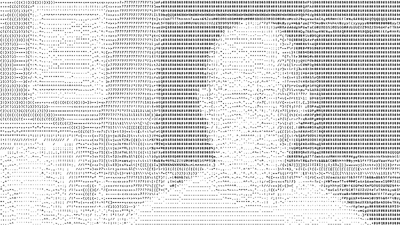
To achieve the look of images created out of type I first began experimenting with simple ASCII text conversions.

Although ASCII text conversation was the simplest solution, I was very unhappy with the results. In this process, pixel brightness is evaluated and then a corresponding character is chosen. So the characters on screen are constantly in flux. Much of my footage would be handheld, so with the constant camera movement, characters in every corner of the screen would be continuously changing. The effect here is much too jittery.
I needed an option where the type could be steady, to personify an orderly system, and perhaps more importantly, I wanted to be able to control the type on screen — to only use characters I wanted.
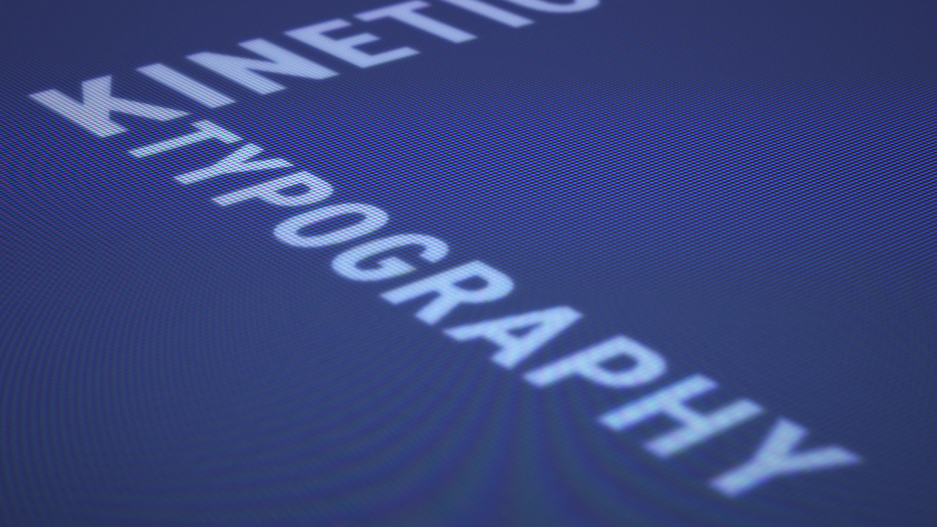
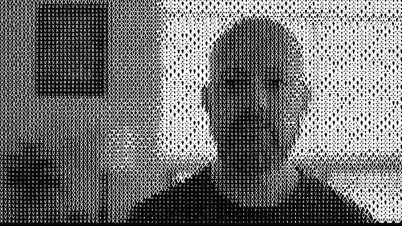
This was the 15th anniversary of the Mapping Festival, so I wanted the images to be created using combinations of Xs and Vs. A subtle nod to the Mapping Festival's heritage.
It was slowly becoming clear that the only way to achieve the look I wanted was to do this via coding.
Unfortunately, I had never coded before.
I managed to find someone else online who had achieved a similar effect and was kind enough to provide their source code. This is a processing sketch by Henk Lamers.
The effect was nearly identical to what I was attempting. Lamers' sketch pulls color information from the source image and applies it to the type while adding a slight rotation. It was also interactive and responded to keyboard inputs.
I removed these options and exaggerated the way that pixel brightness affected the character size of the type.
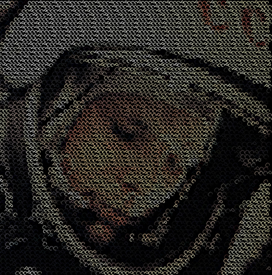
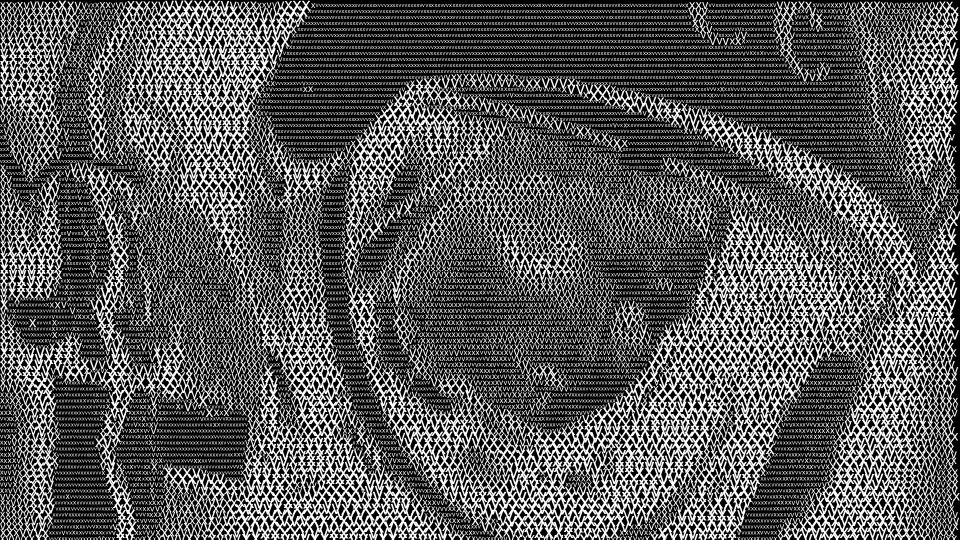
At this point I had only the characters I wanted, and each character increased it's size depending on the brightness of the pixel in the original image. This was exactly what I wanted.
(There was much celebration at this point!)
Just one problem. This sketch was excellent at processing a single image. But I would need to process thousands of frames.
Although a batch process seemed simple enough, for a novice programmer this was a major hurdle.
After a few more days research, I finally had a breakthrough. Ran my code and voila!
Except…
I hated it. :(
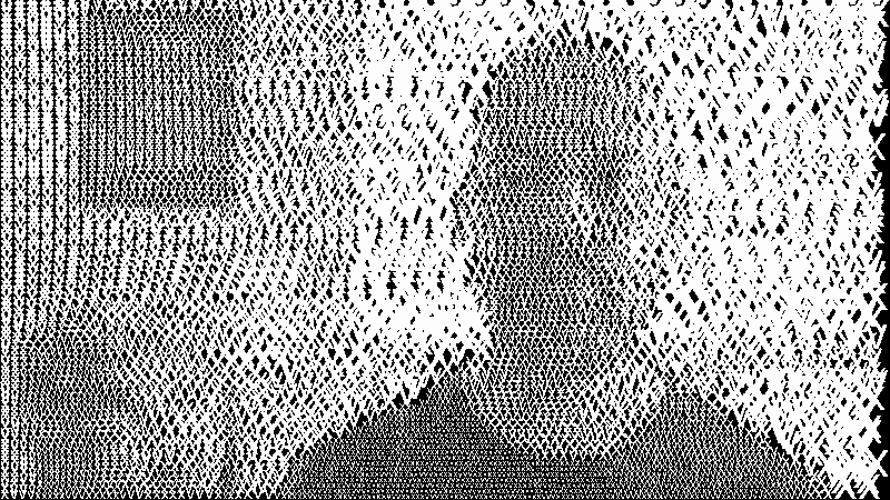
The image was hectic, jumbled and nervous looking.
I realized what was happening was that all of the type was printed out as a string, and as each character changed in size it pushed or pulled the rest of the type further down the line. The end result was a constant flow of characters up and down the strings.
Despondent, I scrapped all my code, and based on what I had learned thus far, started over from scratch.
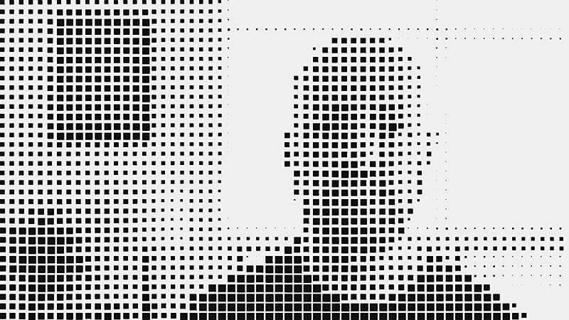
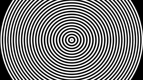
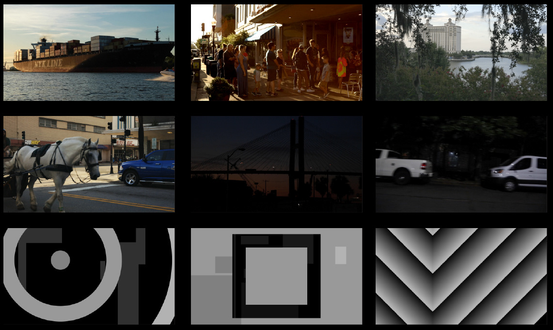
For this version I used simple squares.
The image is divided up into tiles and examined for average brightness. Then this brightness information is used to control the size of the squares.
This resulted in a much more stable image, appropriate for the artistry of the Mapping Festival.
Then it was just a matter of swapping out the squares with my type.
At last, I had a process that would perform exactly as I had planned. Now I just needed to feed it my footage.
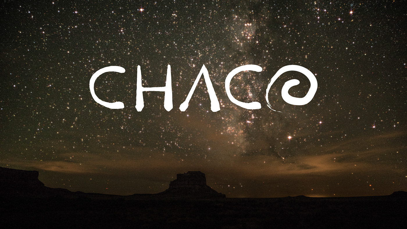
Ideally, these scenes would've been shot around Geneva.
But Savannah will do in a pinch!
A simple processing sketch was used to draw the attending artists' names in Helvetica, and then divide this typography into a grid of any desired size.
Next, waves of chosen frequency and amplitude were sent through the type, animating it.
At this point, the design process was simply choosing the parameters of the grid and waves, then rendering out 30 — 60 seconds of these animations and curating the results looking for the most interesting, yet legible moments of movement.
Then the processed footage was imported into After Effects, colored, and composited.